Project
Rebranding Warren
Role
Design | Project leadership
Warren's rebranding project initially began in collaboration with a design agency and was later brought in-house.
The main goal was to mature the brand in order to better connect with its current audience. The starting point was defining the color palette, typography, and visual elements. After these decisions were made, updates were carried out across product and communication materials, along with the creation of a comprehensive style guide.
Step 1: Discovery
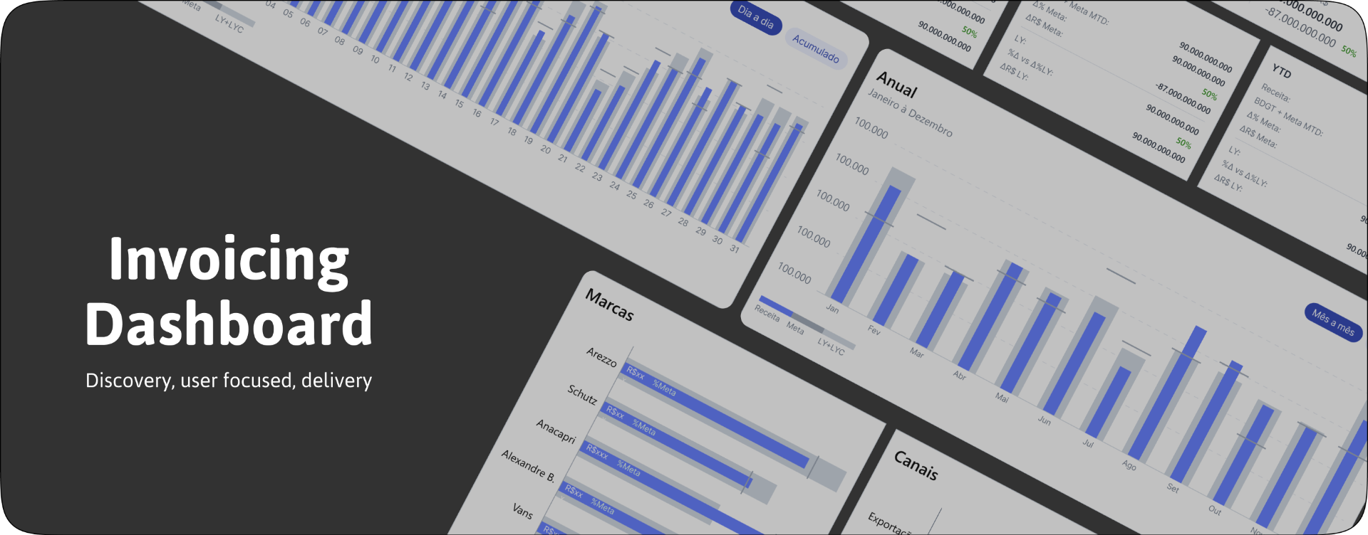
The project began with discussions with the business team to understand their needs: the commercial, billing, and executive teams were using a spreadsheet-based report that was complex to update and read by users. The goal was to translate these reports by integrating them into the data visualization tool: Tableau (Salesforce).
Study of materials and conversation with stakeholders
The first step was to gather information on how the materials were used, updated, and who the main users were. The spreadsheets and reports were manually updated, and the materials were shared for studying the business rules.
CSD Matrix
After the initial discussions, with the information and materials in hand, a CSD matrix was created, and the questions raised were brought to the first user interviews.

Study of materials and conversation with stakeholders
The user interviews were qualitative, involving 5 users from the commercial team, including coordinators and managers. The questions focused on the reading format, frequency of use, how information from the analyses was shared, and suggestions for improvements to the current format.
From the interviews, it was discovered that the ideal approach would be to have two types of analysis in the report: one more agile, with graphs that provided quick insights, and the other with information remaining in tables, as some users preferred more detailed and in-depth analyses.

Step 2: wireframes
Taking into account the needs of stakeholders and users, the first screens were created. The initial version focused on organizing information and user interactions, without giving much consideration to the aesthetics of the screens.

Step 3: High-fidelity prototypes and validation with users and stakeholders
With the wireframes approved and feedback on improvements, the high-fidelity prototypes were developed. The solution was created based on user needs, which at times require quick analysis and insights in graphs, both for visualization and for presenting results. However, users also needed deeper and more detailed visualizations. For these reasons, the visualizations were divided between graphs and cards, and tables as well.

Step 4: Handoff
The process of creating the dashboard, from its inception to the final handoff, took 2 months. There is complexity in translating the data source into the visualization tool, as it is necessary to understand how calculations will be made and how the information will be displayed to generate the correct insights.
The handoff, in addition to providing documentation on interactions and behavior, also includes information on business rules and the data reading format as provided by users and stakeholders.

Main results
- Agility in data reading by users
- Agility in data updates by stakeholders
- Data reliability, coming from the company's official source, eliminating the need for manual updates
- Visual consistency, using standardized charts and components